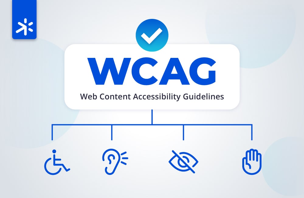
At Sparxworks, we have extensive experience supporting digital accessibility and inclusion for our clients. One of the most important standards we reference is WCAG. WCAG stands for Web Content Accessibility Guidelines, and version 2.1 is the current set of recommendations published by the W3C for making web content accessible for people with disabilities. (Note: WCAG 2.2 W3C Proposed Recommendation is the latest update published on 20 July 2023.)
Unfortunately, many websites and apps still fall short in meeting WCAG guidelines. Here are steps for assessing if your digital content is accessible and actions to take:
- Review accessibility standards like WCAG 2.1 and Section 508 to understand conformance requirements.
- Set up accessibility testing tools like screen readers, magnification software, keyboard navigation, etc.
- Audit code compliance with automated checkers like WAVE, aXe, or Lighthouse. Fix errors and warnings.
- Manually test keyboard navigation and focus order. All content should be reachable.
- Check color contrast ratios. Text should have 4.5:1 contrast minimum.
- Provide text alternatives for images, videos, audio clips, and all non-text content.
- Ensure information is structured logically using proper heading tags and lists.
- Make sure all functionality works without reliance on hover, mouse or touch.
- Validate forms, error messages, and interactive components are usable and accessible.
- Include accessibility statements and contact info so users can report issues.
- Review page titles, meta descriptions, and document titles/properties to ensure clarity.
- Validate that color is not used alone to convey information or prompts.
- Check that all links, buttons, and controls have descriptive names.
- Ensure multimedia has transcripts, captions, and audio descriptions.
- Use tools like wave, aXe, Lighthouse to scan for ARIA, labels, roles. Fix errors.
- Set up automated accessibility tests in CI/CD pipelines to prevent regressions.
- Provide multiple ways to find pages (site maps, search, links, headings).
- Allow content reflow and responsive designs. Don’t lock to fixed layouts.
- Design simple, intuitive navigation with clear labels, structure and feedback.
- Follow auth cues to require only necessary user input. Set autocomplete smartly.
- Bonus: Continuously test with users of all abilities and assistive tech. Their feedback is invaluable.
Taking these steps systematically will help uncover accessibility gaps to address. It also builds skills to consider accessibility early in future projects. Staying current as standards evolve raises the bar.
And, by thoroughly assessing against standards and validating usability for diverse users, your organization can methodically improve accessibility across all of your digital channels
It takes diligence, but pays dividends in experience.


