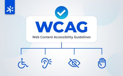
Day 1: Review accessibility standards like WCAG 2.1 and Section 508 to understand conformance requirements.
- Thoroughly read through all WCAG 2.1 and Section 508 criteria. Make notes on areas your site may not comply.
- Watch educational videos and take courses on common accessibility principles. Hands-on learning sticks better.
- Reference standards regularly when making design and development decisions. Keep standards top of mind.
- Discuss standards with your team. Get buy-in on importance of conformance from leadership down.
Day 2: Don’t assume your website works for everyone.
Experience Your Own Site Like Your Users. Install free screen readers, magnification tools, and keyboard navigators. Discover gaps from real user perspectives.
Set up accessibility testing tools…like screen readers, magnification software, keyboard navigation, etc.:
- Download commonly used screen readers like NVDA, VoiceOver, JAWS, and Talkback to test the site.
- Increase browser zoom to 200% and 400%. Site should still be functional and readable.
- Disable mouse usage and navigate site with only keyboard. Tab through all elements.
Bonus Tip: Install browser plugins that disable CSS, images, JavaScript to verify accessibility.
What other testing tools are you using?
Day 3: Did you know website accessibility boosts SEO?
Boost Your Google Ranking with Automated Accessibility Scans.
Run free automated checkers like WAVE, aXe and Lighthouse. Fix errors and warnings to comply with standards.
- Run the site/app through all 3 scanning tools. Compare results to find overlaps.
- Categorize and prioritize errors and warnings from critical to minor.
- Develop a plan to methodically address issues, starting with critical ones.
- Don’t ignore notes – address warnings too. Quick wins boost compliance.
Day 4: Quick Win: Check Keyboard Accessibility.
You’d be surprised how many sites lack full keyboard navigation. Try it yourself – use only the “Tab” key to browse content. Our guide shares how to fix focus order, add skip links, make those quick wins.
Manually test keyboard navigation and focus order. All content should be reachable.
- Only use keyboard Tab to navigate. Ensure logical order.
- Verify all links, buttons and form elements are reachable.
- If the focus order is incorrect, rearrange DOM order of elements.
- Set tabindex attributes only when absolutely needed. Keep focus order clean.
Day 5: Frustrated Users Click Away. Is Your Color Contrast Up To Par?
Low color contrast makes text hard or impossible to read for many.
Test your site with color contrast checkers. Check color contrast ratios. Text should have 4.5:1 contrast minimum.
- Use color contrast checker tools to scan all text/background combinations.
- Where contrast is insufficient, increase text color darkness vs background.
- Avoid light grays for text, especially on white backgrounds.
- Run scans periodically to catch any contrast regressions.
Day 6: Alt Text, Captions, Transcripts: The Multimedia Accessibility Guide.
Videos, images, and audio provide no value if users can’t access them. Give everyone the full experience with alt text, captions, and transcripts. Our guide covers easy ways to make multimedia inclusive.
Provide text alternatives for images, videos, audio clips, and all non-text content.
- All images require descriptive alt text, null if decorative only.
- Videos need transcripts of audio content and descriptions of visuals.
- Audio clips require transcripts. Captions if also on screen.
- Other non-text elements need text equivalents.
Day 7: Boost SEO with Proper Content Structure – Here’s How:
Screen readers can’t make sense of sites without logical headings, lists, and semantics. Structure content appropriately with HTML5 elements. Our guide shares tips to make your site shine for users AND search engines.
Ensure information is structured logically using proper heading tags and lists.
- Only have 1 H1 tag per page outlining the overall topic.
- Use headings to create logical outline and hierarchy on page.
- Break up dense text with bulleted or numbered lists.
- Semantic HTML is key for understandable content relationships.
Day 8: Don’t assume everyone can use a mouse or touchscreen. Test Beyond Mouse & Touch
Test your site’s functionality with keyboard only. Identify improvements so key interactions don’t depend solely on hover or other inputs.
Make sure all functionality works without reliance on hover, mouse or touch.
- Design primary interactions not to depend on hover alone.
- Duplicate or provide hover information in an alternate way like focus state.
- Test all interactions with the keyboard only, no mouse.
- Avoid dependence on mouse/touch to lower barriers to entry.
Day 9: Even error messages need to be accessible to be useful
Validate that forms, error messages, and interactive components are usable and accessible.
- Every form field should have a
- Error messages must be paired with relevant form fields.
- Use ARIA roles appropriately to convey component semantics.
- Review keyboard accessibility of all forms and components.
Day 10: You can’t fix what you don’t know is broken. Disappointed Users Won’t Tell You.
Make It Easy to Report Accessibility Issues. Make it easy for visitors to provide feedback on accessibility gaps.
Include accessibility statements and contact info so users can report issues.
- Add accessibility statement page detailing commitment and known issues.
- Provide contact info and form for users to provide accessibility feedback.
- Respond to feedback in timely manner, log issues in tracker.
- Thank users for reports – treat them like valuable bug reports.
Day 11: Boost Your Click Through Rate → with Accessible Page Titles and Meta Descriptions
Page titles and meta descriptions provide critical context for screen reader users.
Craft descriptive, evocative summaries optimized for searchers to ensure clarity:
- Titles and meta descriptions should accurately summarize page content.
- Avoid generic titles like “Home”, be specific like “SpaceX Mars Mission Overview”.
- Titles should be 60 chars or less, descriptions under 160 chars.
- Update titles and descriptions if page content changes.
Day 12: Unlock a More Inclusive UX by Using Color Responsibly
Color alone leaves some users baffled. Always pair color cues with text, icons or other indicators. Review our tips for accessible use of color in data visualization, prompts, and highlighting
Validate that color is not used alone to convey information or prompts.
- Never use just color to indicate interactivity, Required Field, etc.
- Pair color cues with text, icon, or other indicator.
- Check forms, charts, graphs that currently use color alone.
- Color blindness affects 1 in 12 men and 1 in 200 women.
Day 13: Frustrated Users Exit Quickly. Use Clear Link & Button Tex
Cryptic “click here” links hurt comprehension and the user experience.
Check that all links, buttons, and controls have descriptive names.
- Avoid generic terms like “click here”, “read more”, “continue”.
- Be specific like “Login to your account”, “View more space exploration articles”.
- Write descriptive text considering context of surrounding content.
- Review especially links with innerHTML of only icons/images.
Day 14: An Equal Experience for All – Video Transcripts, Captions, and Audio Descriptions
Make video, audio, and animation accessible with transcripts, captions, and audio descriptions. Our guide makes it easy.
Ensure multimedia has transcripts, captions, and audio descriptions.
- Provide text transcripts for audio and video content.
- Supply captions synchronized to audio for context.
- Include audio descriptions of on-screen activity during gaps in dialogue.
- Combine transcripts, captions and descriptions for full accessibility.
Day 15: Boost Accessibility with ARIA, Labels, and Roles
ARIA attributes like roles allow customization of elements for assistive tech. Learn to use ARIA, labels, roles appropriately.
Use tools like wave, aXe, Lighthouse to scan for ARIA, labels, roles. Fix errors.
- Run scans to catch ARIA issues like missing roles or incorrect usage.
- Check form fields, buttons and links have explicit labels.
- Review that custom widgets use appropriate ARIA roles.
- Fix problems identified to avoid conveying wrong semantics.
Day 16: STOP IT EARLY Accessibility Should Never Regress
Don’t let new defects reach users. Bake accessibility testing into CI/CD pipelines. Surface errors visually. Learn how to stop regressions in their tracks.
Set up automated accessibility tests in CI/CD pipelines to prevent regressions.
- Configure accessibility scans in CI/CD pipelines along with other tests.
- Fail builds if new critical accessibility errors are introduced.
- Set up visual reporting like scorecards and logs for easy monitoring.
- Stop defects early before they impact site visitors.
Day 17: Empower Users to Navigate However They Want.
People don’t use sites linearly. Provide multiple navigation aids like sitemaps, robust search and browsing by headings. Our guide shares tips to meet diverse needs.
Provide multiple ways to find pages (site maps, search, links, headings).
- Offer sitemaps to provide overall site structure and navigation.
- Build in-page navigation based on properly marked up heading tags.
- Implement intelligent site search allowing keyword lookup.
- Not all users navigate or process information the same way.
Day 18: Clunky Sites Drive Users Away – Use Reflowable Responsive Designs
Fixed width sites with horizontal scrollbars frustrate everyone. Utilize responsive design, relative units like REMs, and fluid widths. See how with our practical tips.
Allow content reflow and responsive designs. Don’t lock to fixed layouts.
- Use relative units like REMs instead of fixed pixels for font-sizes.
- Size containers with percentage or viewport widths instead of fixed pixels.
- Craft responsive designs to adapt layout at various viewport sizes.
- Avoid fixed, non-reflowable widths that require horizontal scrolling.
Day 19: Lost Users Hurt Conversion Rates – Guide Them with Clear Navigation.
Overly complex navigation overwhelms users. Implement simple IA, descriptive labels, consistent placement and cues.
Design simple, intuitive navigation with clear labels, structure and feedback.
- Limit navigation depth to reduce cognitive load. Shoot for 1-3 levels max.
- Use clear, descriptive wording in menu and page titles.
- Show current page location prominently with visual indicators.
- Be consistent in placement, order and styling across site.
Day 20: Require Only Necessary Input, Set Autocomplete Intelligently.
Don’t overburden users with unnecessary fields and typing. Follow best practices like only essential info, smart autocomplete, and descriptive labels. Our guide helps optimize forms.
Follow auth cues to require only necessary user input. Set autocomplete smartly.
- Only ask for truly required info to reduce user effort.
- Implement autocomplete on forms to limit typing where possible.
- Set autocomplete attributes properly on fields to enable right suggestions.
- Eliminate unnecessary fields and use smart autocomplete to lower barriers.
Get our top 20 tips to improve your business here.